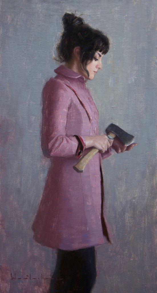
 “Intent” one of the paintings I will be showing at the ” Past Presence ” Exhibition September 6th, 2012
 “Intent” one of the paintings I will be showing at the ” Past Presence ” Exhibition September 6th, 2012
The Benningtonin Bennington Vermont. 70 artists selected by the editors of American Art Collector, Southwest Art & Fine Art Connoisseur Magazine are coming together to form this Show beginning June 9 – July 15
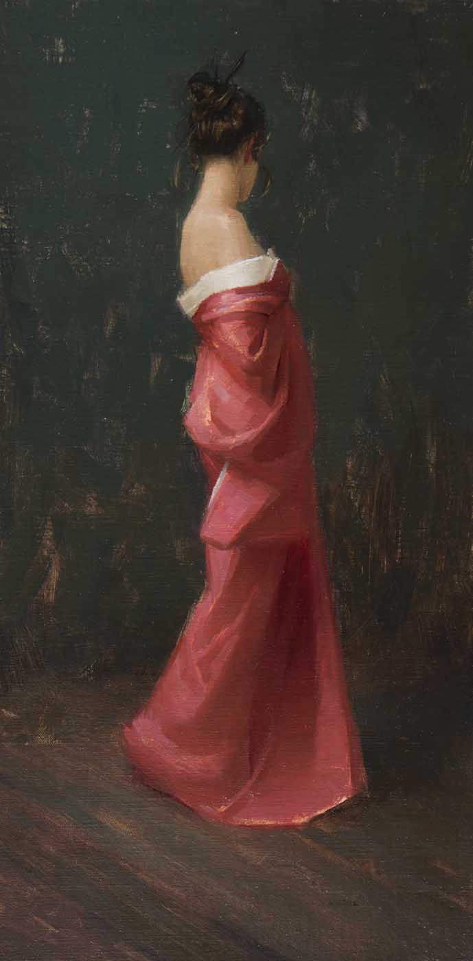
I will be showing “Pink Kimono” 22×11 oil on panel
I am pleased to be a part of a newly published book ” Sketchbook Confidential II” The book contains many rough sketches, that you rarely see, as well as some of more finished works by some of today’s top Artists. Including Kate Sammons, Michelle Dunaway, Micheal Steirnagle, Kyle Stuckey, and me !
Beginning March 15th I am in this group show in Naples Florida @ Gardner Colby Galleries with some other very talented artists including Edward Minoff, Olga Antonova, and Peter Plamondon I hope you can make it.
The easier it is to absorb the information in a book the better. For me a book is valuable because of what it contains and if it remains closed or is hard to manage it isn’t helping me learn and grow as an artist. And as visual artists most of our books aren’t about the text, it’s all about the pictures. For this reason I have my instruction type books Spiral bound.
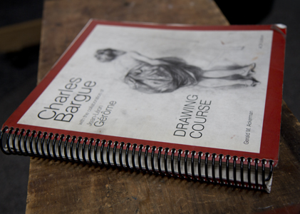
Kinkos or Staples does this service for around $2.50 a book.
This makes the book MUCH easier to manage. I can put it up in front of me on my easel and I don’t have to fight to have the book stay open to see the illustrations I want to learn from.
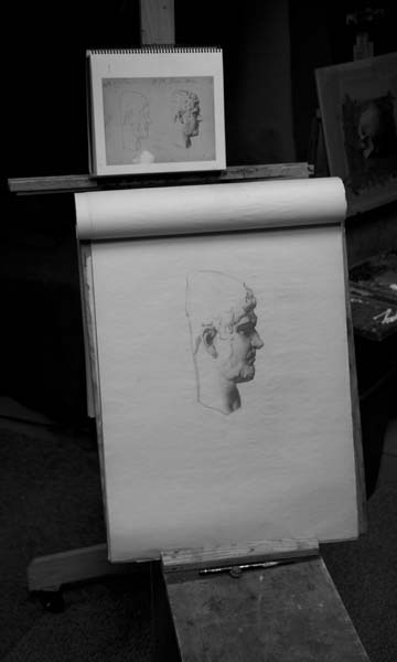
I also do this with smaller sized books like George Bridgeman’s book on life Drawing and John Vanderpoel’s book, two of my all time favorites. I like to have these two books with me when go to drawing workshops. Often in these type of situations I like to sketch from these books when the model is at break or if I get to the workshop early. Spiral binding these books allows me to easily hold one in my hand while drawing with the other. When I was attending collage I would draw from these books when I was in my car waiting for class begin.
The Bridgman book is more for construction and the drawings in it are mainly liner. The Vanderpoel book is more about refinement of anatomy most of the drawings are tonal and the Charles Bargue book is all about simplifying complex forms. It is both linear and tonal. All three of these books I highly recommend. I however cannot end this post without recommending probably the best instructional author of them all: Andrew Loomis. Head and Hands and Figure Drawing for all its Worth probably his best works cover just about everything but the strength of his books lies in his finishes. He has the best looking finished drawings. These books have been out of print for a while but recently they have been reprinted and you can now order them from amazon or wherever.
click on any of the books above to link to Amazon
I am teaching a 5 day Portrait and Figure painting Workshop in Scottsdale Arizona February 27th-March 2nd. The Scottsdale Artist’s School is one of the best places to take a workshop like this. There are plenty of close hotels, most less then a mile away, tons of great places to eat and drink and they have the best staff. I felt immediately at home and comfortable when I first traveled to Arizona to conducted a workshop.
The workshop will cover the Head and Figure. I will do a Portrait and a Figure Demo on the first and third day. The class will work from a model the rest of the time and I will do a lecture almost everyday. The lectures will cover the fundamentals of oil painting along with a couple secret painting tips here and there.
Click here to go to the Scottsdale Artist School Website
One of the Best Galleries out there, Whistle Pik in Fredericksburg Texas, has added a new feature to their web site. Its called New Spin 360 degrees. I’ve never actually been in this gallery until now and WOW its a nice feature ! Basically it allows you to view the works in the gallery without leaving your home. So you can view how the paintings and sculptures look framed and on the wall. Check it out you can see everything in the gallery, well… you can’t fully see my paintings……. yet. My work is in the main gallery behind a desk and only visible from the side.
View the gallery feature by clicking here
To view the paintings I currently have for sale at Whistle Pik Gallery click here.
A color sketch for me is a preparatory study for a finished painting. Creating a color sketch can be one of the best ways to approach a painting weather it be a large or modest size work. I always do a color sketch before I do my more finished paintings.
My criteria for the sketch :
—It has to be done somewhat quickly. (if there is too much thinking involved your spending too much time on it)
—Has to be “mostly” accurate in values, color, drawing and composition but there can’t be any details. No faces fingers or toes.
|
—It can’t be bigger then 10×8 or so.
(These are my basic guidelines, you will develop your own after you do a few.)
The advantages are numerous!
Relaxation —- After I do the sketch and I can see my color and value choices and how they are or aren’t working together. This allows me to “relax” and work on my drawing in the larger work knowing the color and compositional direction I am heading. It takes a lot of the guessing out.
Choices-— it also allows me a sneak peak, if you will, at how my painting will look as a finished work. Allowing me to push or pull colors, values, or drawing a little more or less.
Problems— doing the comp allows me to take on any of the problems that might raise their ugly head. These are usually things you didn’t anticipate after looking at your reference. It can be anything: a difficult drawing issue, color harmony, or a compositional problem. Sometimes you just have to go through the motions and do the study to really understand what you are getting your self into.
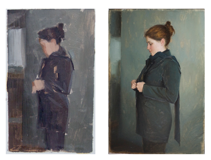
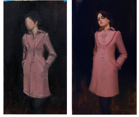
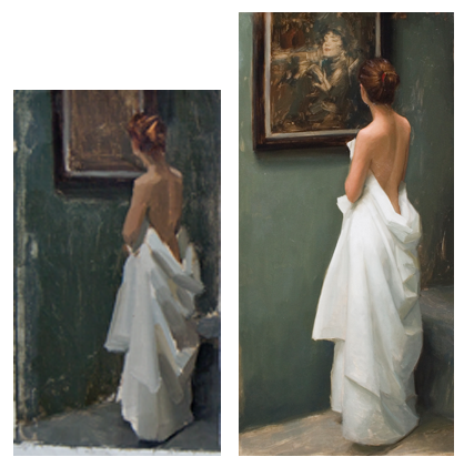
Below are a few of my color sketches next to the finished paintings. Notice how close or what I changed compared to the finished works. ( Note these color sketches are small, 4×5 inches )
This is a very simple yet helpful addition you can easily add to your studio palette. It will save you time, space, and your Brushes!!
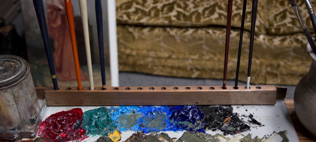
Why?
My clean brushes often get paint on them from my dirty brushes.
I lose track of which brushes I have used and the paint dries in the brush and ruins it.
Palette Room: It saves valuable mixing space on my palette.
Cleaner color: I am better organized in that I can keep track of the brushes that I used for my darker or lighter colors. ( I don’t have to wash my brushes out with mineral spirits as much )
How
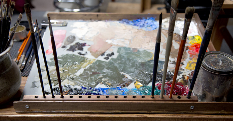
I made the brush holder with:
-A piece of 1″x 1/2″ piece of wood from Home Depot
-Drill
– Drill bits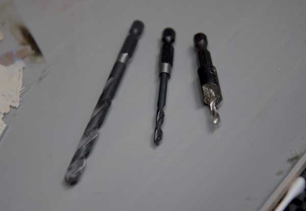
(The bit on the far right is a starter bit)
– a couple of screws to hold it to my palette
I pre-drilled each hole with a starter bit approximately one inch apart from each other. From there I made some of the holes wider and some thinner. That’s pretty much it! Happy Painting!!!!
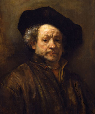
Ivory Black (Bone Black, PBk9) The Romans created this black as an all purpose black by either charring ivory or bones of animals. It is semi transparent and bluish in color but has a brownish tint to it when used thin. Ivory black has a slow drying time and is moderate in its tinting strength. Rembrandt used Ivory black.
Lamp Black ( Carbon Black, PBk6) Lamp Black was originally produced by burning vegetable oils, but these days by burning tar, creosote, naphthalene, or other petroleum products. It is one of the oldest blacks and can be traced back to prehistoric times. Also a slow drying and bluish in color but has a bluish undertone when used thin. It is an opaque color and is stronger in tinting strength then ivory black.
Mars Black (PBk11) Mars Black was developed early in the 20th century. It is an iron pigment in the same family as synthetic iron oxide pigments and has the strongest tinting strength. Mars Black is the warmest of the three blacks when used thick or thin. It has a fast drying time so it’s the best to use as an underpainting color. Mars black also dries very matte.
Payne’s grey is not a black but is a dark color invented in the late 18th century and named after William Payne a 18th a watercolorist. It has a bluish tint and is weaker then any of the blacks above in terms of tinting strength. Payne’s Grey is actually a mixture of a blue and black, usually ultramarine blue and ivory black but every brand is a little different.
Perylene Black (PBk31) invented in 1948 is a black pigment with a strong green undertone. It is a synthetic organic pigment, not carbon or iron oxide based like all the other black pigments. Perylene black has a slow drying time and is transparent.
Below is a small color chart where I mixed each of these dark pigments , the exception being the first square, with white.